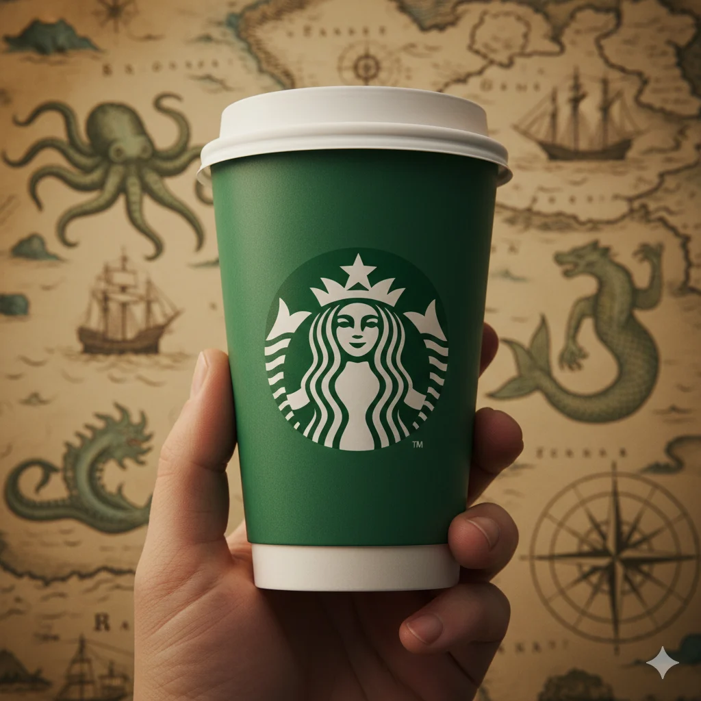
I’ll never forget the first time I really looked at the Starbucks logo. I was waiting in a long drive-thru line, staring blankly at the green circle on the car in front of me. For years, it was just the “coffee lady.” But in that moment of boredom, a question popped into my head: Wait, is that a mermaid? And why does she have two tails? It felt like noticing a secret hidden in plain sight. That simple circle, a beacon for caffeine seekers worldwide, holds a story centuries old, rooted in seafaring myth and coffee trade history. If you’ve ever been curious about the woman in the logo, you’re about to dive into a tale more fascinating than you might expect.
The Starbucks logo features a twin-tailed Siren, a mythical creature from Greek mythology. She represents the seductive and alluring call of the sea, which Starbucks links to the irresistible allure and premium quality of its coffee. The green color symbolizes growth, freshness, prosperity, and the rich, evergreen coffee fields.
✨ What is the Story Behind the Starbucks Siren?
The core figure in the Starbucks logo is not just any “coffee lady”—she is a Siren. In Homer’s epic The Odyssey, Sirens were dangerous yet enchanting creatures who lured nearby sailors with their hypnotic singing to shipwreck on the rocky coast. While this sounds ominous, Starbucks founders used this mythology to their advantage.
The Siren symbolizes the seductive appeal of coffee and the seafaring history of the coffee trade. In the 1970s, when Starbucks was founded in Seattle—a major port city—the name “Starbuck” was taken from the first mate in Moby-Dick, a classic novel about the sea. The Siren perfectly bridged the idea of a nautical theme with the concept of luring in customers with the finest roasted coffee beans. She is the embodiment of an irresistible call, drawing you in for a perfect cup.
In short: Starbucks Logo = A Twin-Tailed Siren = The Alluring Call of the Sea, Representing the Irresistible Allure of Coffee.
🏛️ The Historical and Mythological Roots of the Siren
To truly understand the logo, we need to go beyond the 1970s. The Siren, or Melusine as she appears in 15th-century European folklore, is a figure with a deep history.
- Greek Mythology: The original Sirens were often depicted as half-bird, half-woman creatures. Their song was so captivating that sailors couldn’t resist, leading to their doom.
- Norse and Germanic Lore: The twin-tailed figure is also linked to tales of water spirits and mermaids, often seen as symbols of fertility, beauty, and danger.
- Heraldic Symbol: The twin-tailed Siren was a common figure on old maps and woodcuts, representing the dangers and mysteries of the sea. This is the specific illustration that Starbucks co-founder Terry Heckler discovered and fell in love with.
By choosing this ancient symbol, Starbucks embedded its brand with a sense of history, mystery, and adventure.
🔄 The Evolution of the Starbucks Logo: A Visual Journey
The Starbucks logo hasn’t always been the streamlined, green-only emblem we know today. Its evolution tells a story of a brand growing in confidence and simplicity.
| Era | Description | Key Changes |
|---|---|---|
| 1971 (Original) | A detailed, brown woodcut-style logo. The Siren was fully visible, with a bare chest, a detailed navel, and her twin tails on full display. The words “Starbucks Coffee, Tea, and Spices” surrounded her. | The original, most detailed and “risqué” version. |
| 1987 (First Major Redesign) | The color changed to the now-iconic Starbucks green. The Siren was cropped slightly, and her navel was hidden by her flowing hair. The design became more stylized. | Introduction of the brand’s signature green color. |
| 1992 (Streamlining) | A closer crop on the Siren’s face. Her navel was completely removed, and the design became cleaner and more corporate-friendly. | A move towards a more modern and less literal symbol. |
| 2011 (Present Day) | The logo was simplified to its essence. All text and the outer ring were removed, leaving only the green Siren. This signaled a shift—the brand was so established it no longer needed to spell out its name. | The ultimate simplification, relying purely on iconic symbol recognition. |
🎨 Why is the Starbucks Logo Green?
Color psychology plays a massive role in branding, and Starbucks’ choice of green is a masterclass in the subject. The specific shade, known as Starbucks Green (Pantone 3425), was adopted in 1987. It represents:
- Freshness: Evoking the fresh, rich flavor of coffee beans.
- Growth: Symbolizing the company’s growth and the growth of coffee plants.
- Prosperity & Wealth: A nod to the premium, high-quality nature of their products.
- Natural & Renewal: Connecting to the natural, earthy origins of coffee and a sense of environmental responsibility.
This green is now synonymous with the brand, creating a feeling of calm, refreshment, and reliability.
📱 Where You See the Starbucks Logo Today
The Starbucks Siren is one of the most recognizable logos in the world, appearing in countless contexts:
- ☕ Cafés & Storefronts: The primary beacon for coffee lovers.
- 📱 The Starbucks Mobile App: Used for ordering, payment, and rewards.
- 🛒 Consumer Products: On bags of coffee, bottled drinks, and merchandise sold in grocery stores.
- 🌐 Social Media: A central profile picture on platforms like Instagram, TikTok, and Facebook.
- 🎁 Gift Cards & Branded Merchandise: From tumblers to mugs, the logo is a status symbol.
💬 Decoding the Logo’s Secret Meaning: A Fun “Conversation”
Think of encountering the logo as a silent conversation between the brand and the customer.
Scenario 1: The First-Time Visitor
A: “I’m new, what’s good here?”
B: “Just look for the green Siren. She’s literally luring you toward that caramel macchiato. You can’t go wrong.”
Scenario 2: The Loyal Customer
A: “Why are you always going to Starbucks?”
B: “The Siren’s call is too strong! My app points right to her.”
Scenario 3: A Brand Discussion
A: “It’s just a mermaid, right?”
B: “Actually, she’s a twin-tailed Siren from mythology! It represents the seafaring history of coffee. Mind blown.”
Disorderly Conduct Mean: A Tiny Detail That Changes Everything
✅ When to Use and When Not to Use the Starbucks Logo Analogy
Understanding the logo’s meaning is great for conversation, but how and when should you bring it up?
✅ When to Use This Knowledge:
- In Casual Social Settings: A fun fact to share with friends over coffee.
- In Marketing or Design Discussions: As a brilliant case study in branding, symbolism, and logo evolution.
- As an Icebreaker: A unique piece of trivia that can spark an interesting conversation.
❌ When Not to Use It:
- In a Formal Business Presentation: Unless the topic is directly related to branding, it may come off as off-topic.
- As a Criticism: Pointing out the Siren’s “seductive” or “dangerous” origins to criticize the brand can be a stretch and is often misinterpreted.
- When the Starbucks Brand is Irrelevant: Forcing the fact into an unrelated conversation.
| Context | Example Phrase | Why It Works |
|---|---|---|
| Friend Chat | “Did you know the Starbucks logo is a mythical Siren? How cool is that!” | Casual, fun, and engaging trivia. |
| Marketing Meeting | “We should aim for iconic recognition like the Starbucks Siren, which effectively communicates its brand story without words.” | Professional and relevant to the topic. |
| Formal Email | “The company’s branding should be clear and professional.” | Sticking to the point without relying on pop culture analogies. |
🔄 Similar Iconic Logos with Hidden Meanings
Starbucks isn’t alone in embedding a deeper story into its logo. Many major brands use symbolism to connect with consumers.
| Brand | Logo Feature | Hidden Meaning |
|---|---|---|
| Amazon | The smile arrow | The arrow points from A to Z, representing they sell everything. It also forms a smile, signaling customer satisfaction. |
| Toblerone | A mountain with a hidden bear | The mountain is the Matterhorn. The hidden bear represents the Swiss city of Bern (“Bern” means bear). |
| Baskin-Robbins | The “BR” pink logo | The pink parts of the “B” and “R” form the number “31,” representing their 31 famous flavors. |
| FedEx | The company name | The negative space between the “E” and the “x” forms a perfect arrow, symbolizing speed and precision. |
❓ FAQs About the Starbucks Logo
1. Why did Starbucks remove the word “coffee” from its logo?
In 2011, Starbucks removed the text to signify its expansion beyond just coffee. The Siren had become so iconic that she could stand alone, representing the entire brand experience, which includes tea, food, and merchandise.
2. Is the Starbucks logo a mermaid or a siren?
She is technically a Siren from Greek mythology. The key difference in the depiction is her twin tails, a classic attribute of the Siren in historical woodcuts, which she uses to captivate and lure.
3. Has the Starbucks logo always been green?
No! The original 1971 logo was brown. The switch to the now-famous Starbucks green happened in 1987 to better represent the brand’s values of growth, freshness, and richness.
🧭 Conclusion
The next time you pick up a cup with that familiar green circle, you’ll see more than just a logo. You’ll see a centuries-old Siren, a nod to seafaring adventure, and a masterclass in branding. The Starbucks logo is a perfect blend of history, mythology, and commerce, designed to lure us in not with a dangerous song, but with the promise of a familiar and comforting experience. It’s a reminder that even the most everyday objects can have a rich and enchanting story behind them—all you have to do is look a little closer. Now, who’s ready for a coffee run? The Siren is calling. ☕

Andrew Jones is a digital content specialist, quotes writer, and education-focused author at Jinglas.com. He creates clear, engaging explainers on tech, online learning, and modern communication to help readers understand trends, slang, and digital tools with ease.


